A conceptual climbing gear brand built around performance, durability, and a bold visual identity rooted in adventure culture.
Many climbing brands either focus so heavily on technical function that the identity feels generic, or lean into style without clearly communicating trust and performance.
There was room for a brand that could do both: feel exciting and still feel credible.
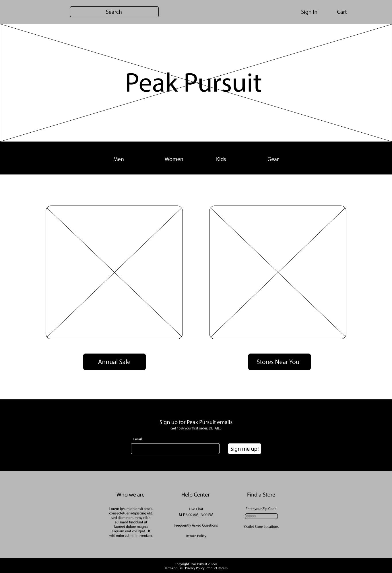
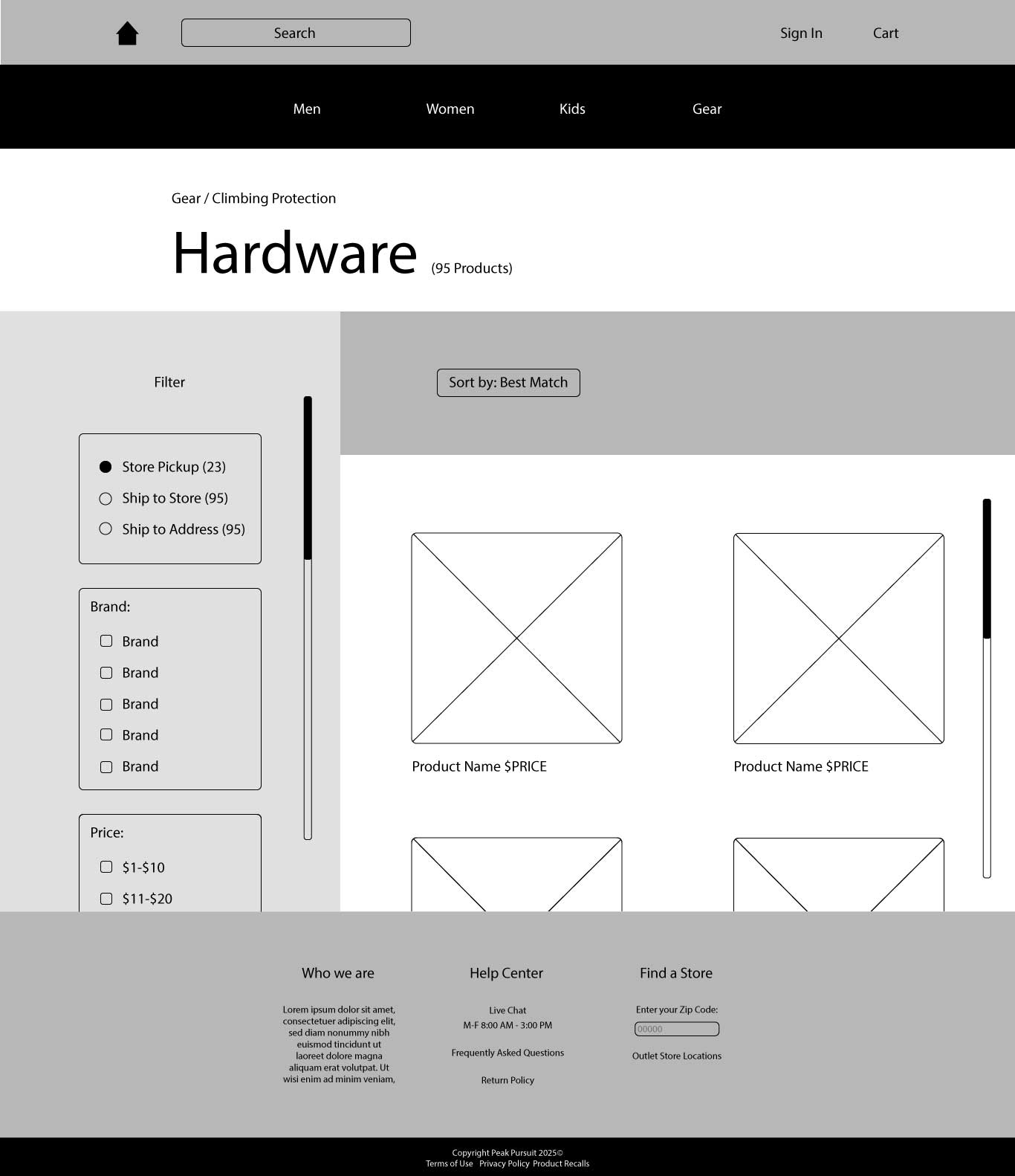
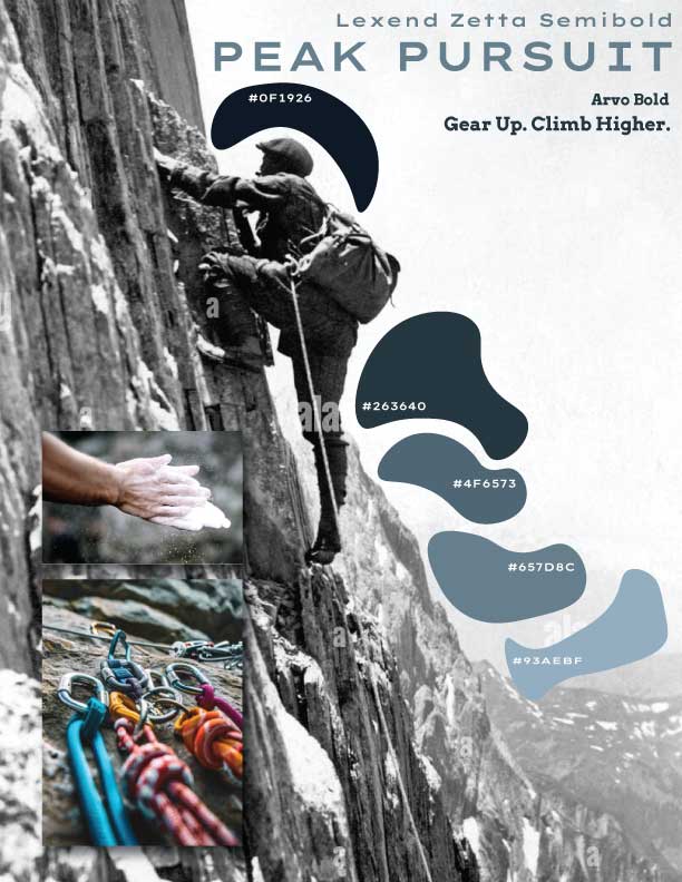
I developed a visual system that combines bold, adventure-driven branding with a clean and structured layout approach. The identity emphasizes strength, elevation, and movement through typography, contrast, and rugged imagery.
The system extends across product and marketing touchpoints so the brand feels consistent, recognizable, and grounded in the climbing environment.
The final result is a cohesive identity that captures the spirit of climbing while remaining polished and market-ready. It balances aesthetic energy with performance-focused messaging.
This project strengthened my ability to build a full brand system around a specific audience and lifestyle.